The Style Guide
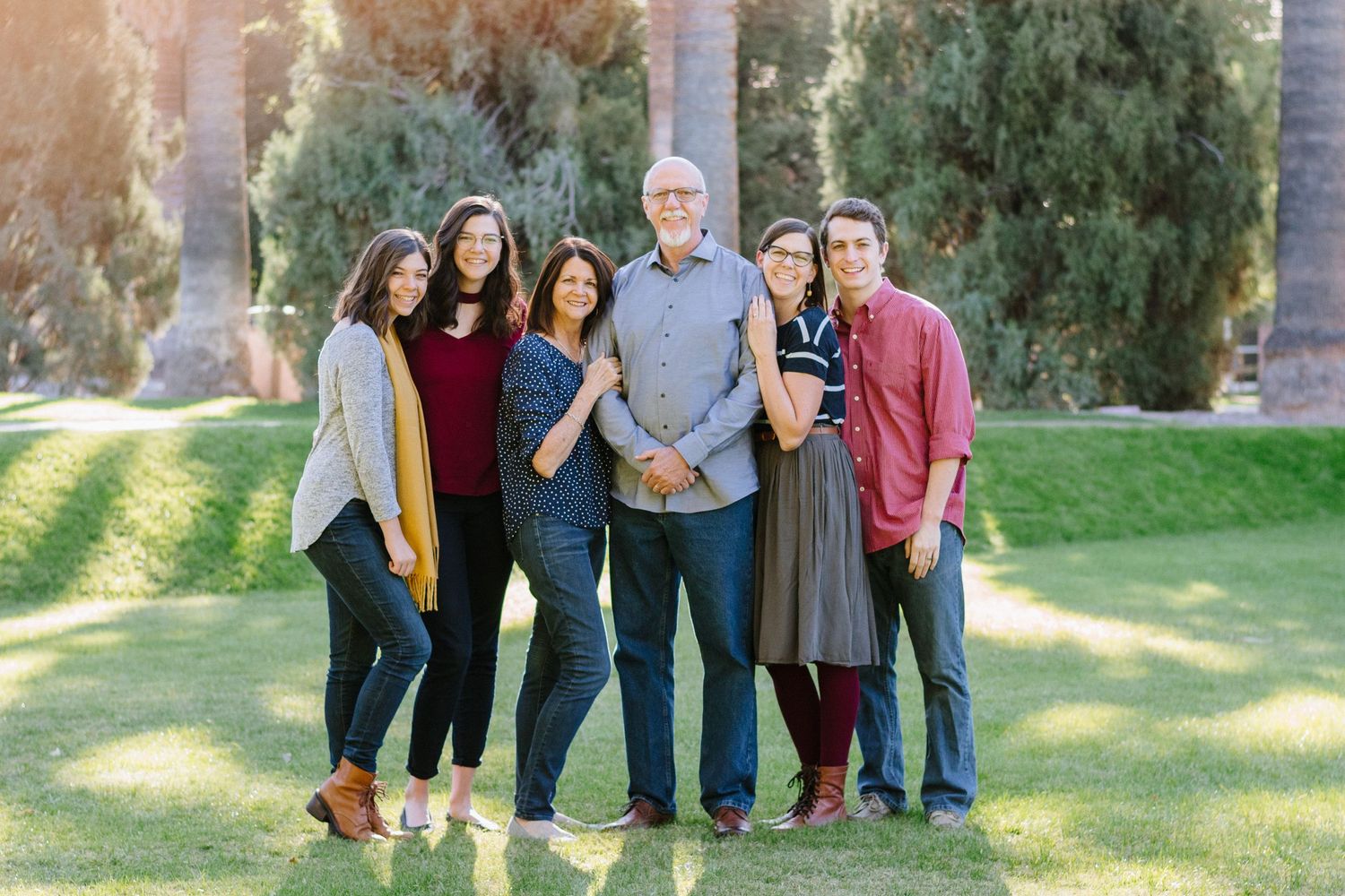
Below are a few suggestions for how to dress for your photos. These ideas are most important for families and couples, or any photos with more than one person in them. Keep in mind that what you wear depends on your personal style preferences, the location of the shoot, and what you feel best in. There are no hard and fast rules of what to wear, so if you want to wear something contrary to what's below, feel free! Ultimately these are your images and I want you to love them. If you have any questions or want my input before the shoot, I'd be happy to lend my support as you pick your outfits.
Warm tones
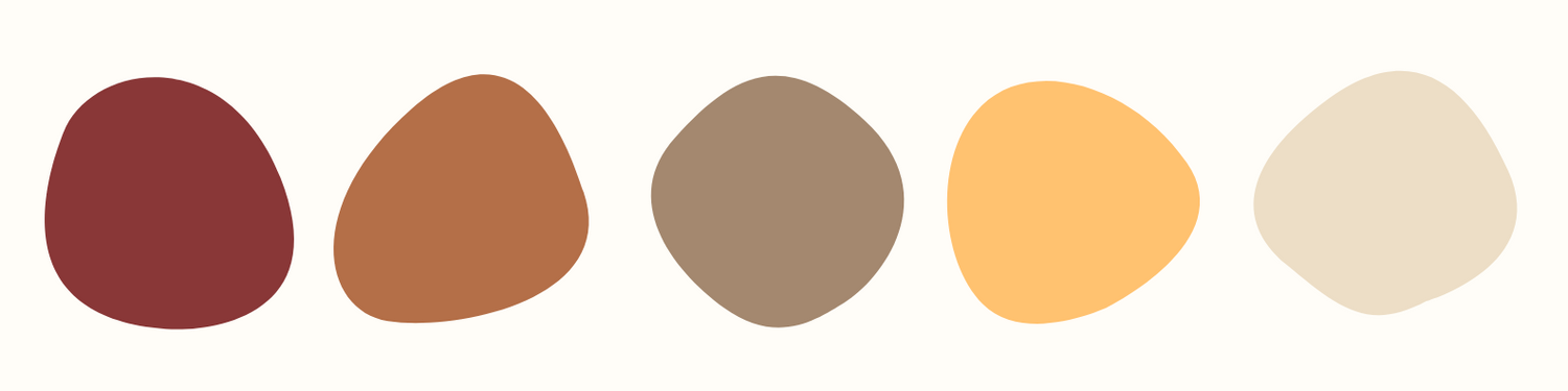
For rich, warm images, especially in the fall season, picking a warm neutral color palette is an excellent choice. Try to keep any patterns basic for less distraction - wide stripes or neutral plaids work well, as long as all colors are in the palette.
Try to balance any patterns with solid colors. Picking two different yet complementary colors, such as brown and navy, can give the photos balance and add visual interest. Also keep the photo location in mind - choose colors that will complement the background or stand out best.
Cool tones
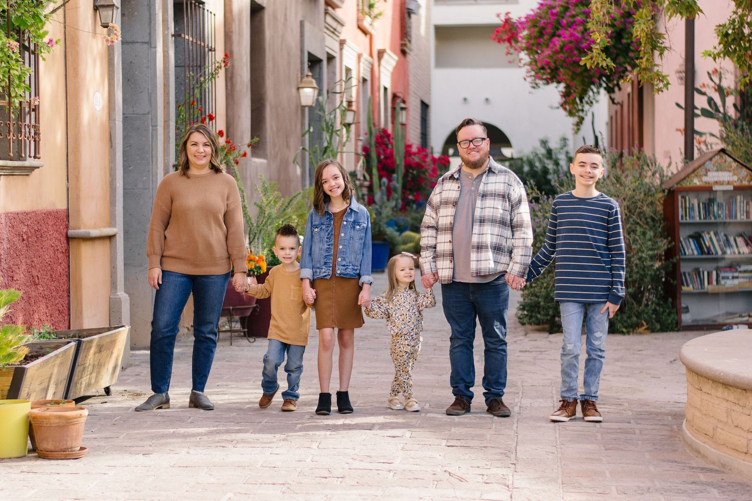
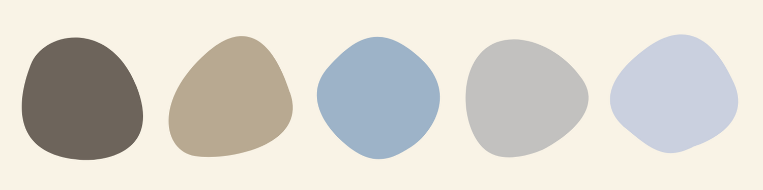
Choosing a cooler toned neutral palette can be a simple way to make your photos timeless and pleasing to the eye. Greys, charcoals, blacks, khakis, and blues all work well together, so dressing your family to all match and complement each other in this palette should be a breeze.
Keep in mind whether you want to look more casual and relaxed, or more formal and polished. Make sure each family member is dressed accordingly. Don't forget to pick neutral and undestracting shoes, too!

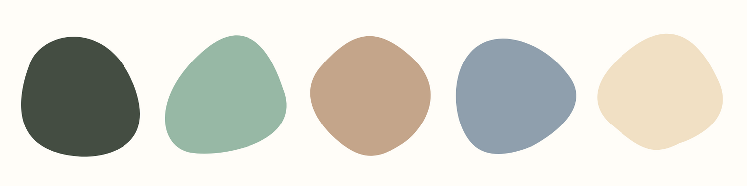
Neutral Tones
There are so many options when it comes to neutrals, so be creative with which color you choose! Whether you stick to browns, blues, or even greens, choosing one main color and dressing each person in a different shade can look clean, flattering, and timeless.
Simple outfits, such as a sweater and jeans or a button down with khakis, in solid colors, will keep the focus on you rather than your outfits. Avoid graphic tees and bright or clashing colors with hectic patterns - that could wash you out, clash with the background, or date your photos in a negative way.

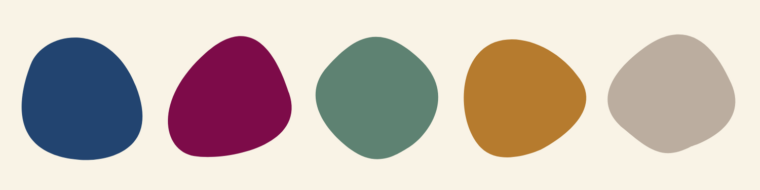
Jewel Tones
If you think that neutral tones are boring or don't match your personality, then by all means choose some bright colors that you love! As long as you choose colors that work well together and remember to keep patterns simple, your photos can be as colorful as you like.
Jewel tones are an excellent way to add some rich color and pop to your images. A mix of warm and cool colors can create visual interest and give you more colors to play with. Above all, be yourself and express yourself authentically!
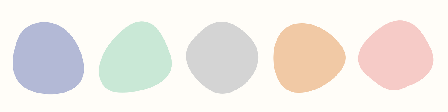
Pastel Tones
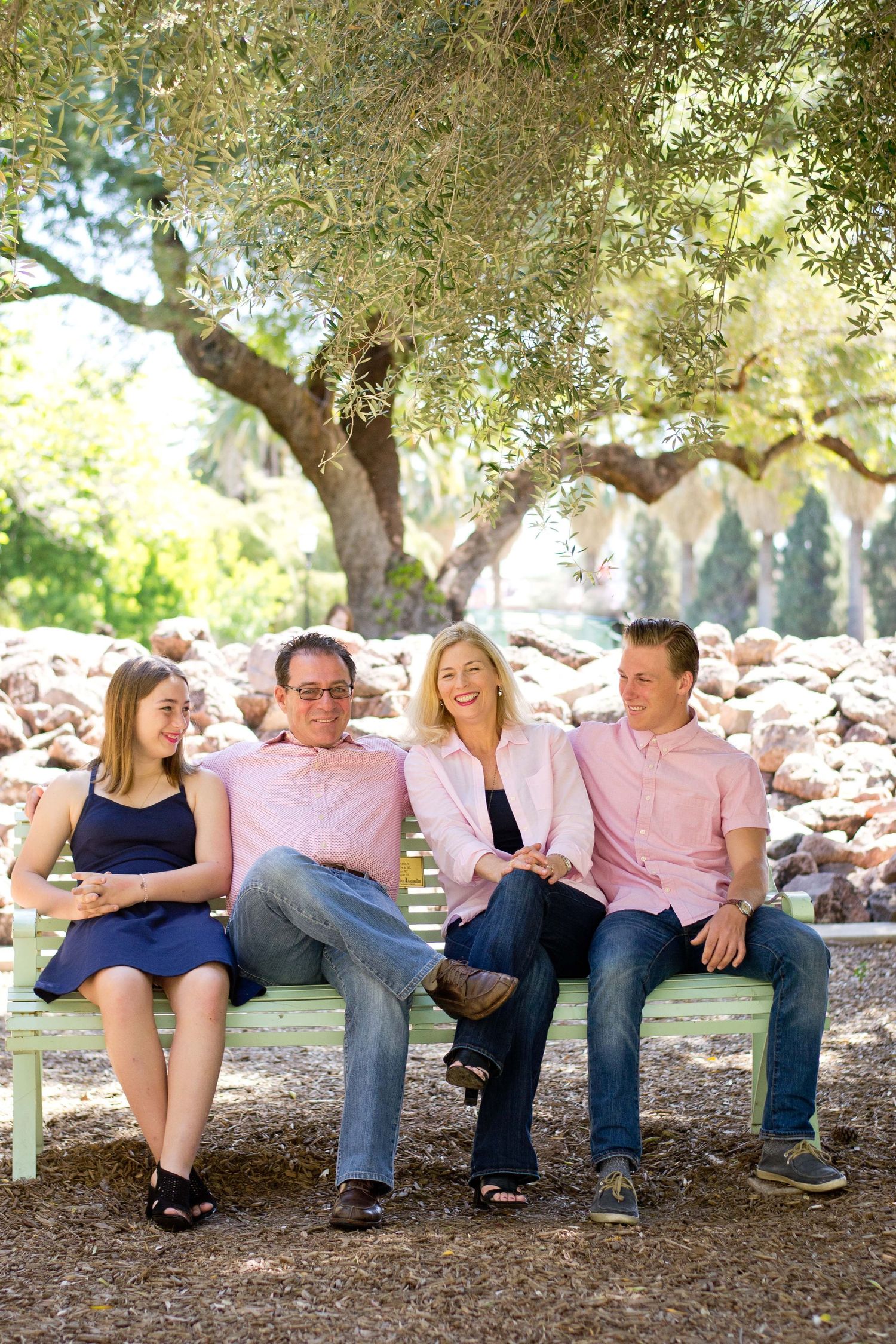
Another way to add a pop of color that feels light and bright is with pastels. A pastel color palette works especially well for photos taken in the spring or summer. Pick one, two, or three different colors and have each family member mix and match accordingly.
You could also pick a darker neutral, such as navy, and a contrasting pastel color, like soft pink. Greys and whites are also excellent for balancing with pastels. If you're still not sure what to wear, you can search Pinterest for photo shoot outfit ideas or color palette inspiration.